


From its inception, Collective Next has always been in the business of change—and a lot has changed in the last 15 years, both for our clients and ourselves.
As an organization we have always attracted, valued, and cultivated creative talent, but in the early days we didn’t have a traditional creative department. Sure, we did a lot of creative work, but it was always in service of our in-person events. And when we showed up at events, we needed a logo.
![]()
Our first logo was born from a sketch Brett drew on a napkin. There wasn’t a robust design review within the company. We tested it with friends and family that was that.
![]()
As our pool of creative talent expanded over the years, we talked about revisiting our brand identity. There were some minor adjustments to the typography and the logo, but the biggest change was when we took the step of adding the tagline: Come Together, Think Better, Move Forward.![]() As our business grew, more and more of our work was falling to the category of “Visual Communications.” So, about 8-years ago, we formed our creative department within Collective Next. We called ourselves Art Directors, we worked with Designers, and we focused on growing our capabilities.
As our business grew, more and more of our work was falling to the category of “Visual Communications.” So, about 8-years ago, we formed our creative department within Collective Next. We called ourselves Art Directors, we worked with Designers, and we focused on growing our capabilities.
Since then, we’ve doubled in size and grown exponentially in creative skills.
Just over a year ago, we started working with our internal marketing team to refine our brand in earnest. After stepping back and reflecting, a few key messages emerged about who we are, what we do, how we do it. Then our creative team got to work developing a visual identity to bring these ideas to life.
This was an exciting opportunity to really highlight how we’ve grown and evolved as an organization, as well as establish some guidelines around how we use each component of our visual identity (cue the brand police).
If you’ll indulge us as we nerd out a bit, here is our thinking and where we landed:![]() The Logo represents who we are. It’s the most ubiquitous and flexible component of our brand. Our new logo is more modern; we updated the styling on our original typeface. It’s a more open and inviting version of us.
The Logo represents who we are. It’s the most ubiquitous and flexible component of our brand. Our new logo is more modern; we updated the styling on our original typeface. It’s a more open and inviting version of us. ![]() The Tagline conveys what we do—marketers call it the governing brand idea. Our initial tagline (Come Together. Think Better. Move Forward) highlighted our process. In contrast, our new tagline is action oriented: Create What’s Next spotlights results. Visually, we’ve moved from a standard typeface to hand-drawn lettering to showcase our roots in Graphic Facilitation.
The Tagline conveys what we do—marketers call it the governing brand idea. Our initial tagline (Come Together. Think Better. Move Forward) highlighted our process. In contrast, our new tagline is action oriented: Create What’s Next spotlights results. Visually, we’ve moved from a standard typeface to hand-drawn lettering to showcase our roots in Graphic Facilitation.

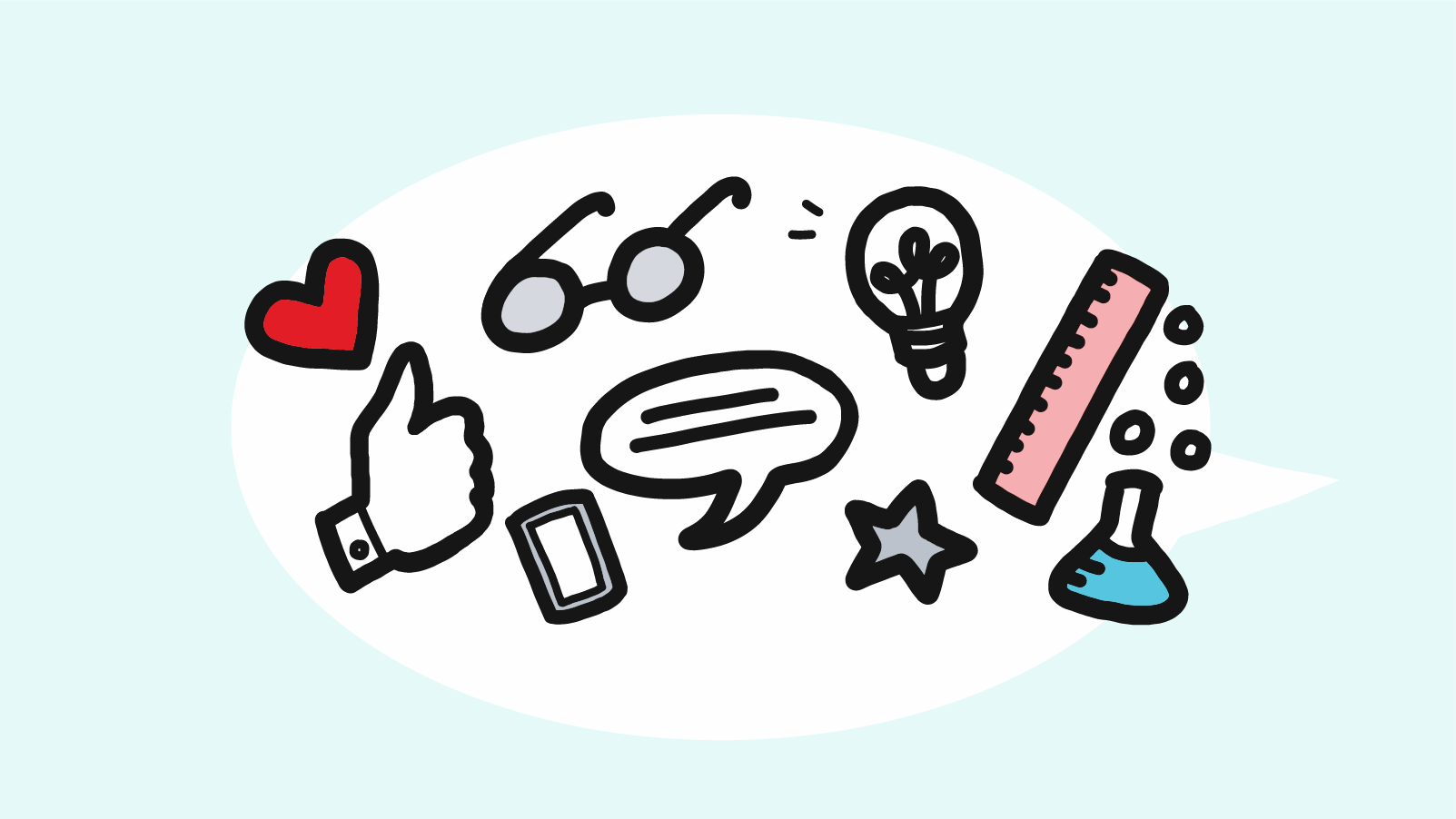
The Stamp is a bite-sized visual summary of our brand. It’s well-suited to social media and other online platforms. In many ways the journey around our visual identity—the desire to distill and communicate our new story while remaining true to our core values—is contained in this stamp.
As designers, we subscribe to the adage that “a picture is worth a thousand words” and perhaps an animation even more. Take a look below to see what we mean.
Hello, Event Planners! Our decades of working together has fostered deep respect for your commitment to creating memorable client experiences. As solution designers and facilitators, we share this commitment, and—like you—we understand the challenges involved in creating dynamic large-scale events…virtually. We’re here to help you provide unique solutions. Just as graphic facilitation and visual communications […]
“What does Collective Next do?” Since our early days, our response to this question has been: “We help people ‘come together, think better, and move forward.’” And in the simplest terms that is what we have always done (and still do). We utilize collaboration, creativity and the ‘art of facilitation’ to help our clients make […]

With global eyes watching COVID-19 and limitations on travel, companies need effective and engaging ways to collaborate in the absence of face-to-face meetings. In-person gatherings have unique benefits, but by combining new technology with appropriate facilitation, your company can conduct dynamic virtual meetings. Collective Next has been working in the virtual meeting space for the […]