On this week’s episode of NibSqueak, our podcast about visual tools for working better, we’re exploring data visualization. John talks shop with data viz wiz Randy Krum, author of Cool Infographics and President of InfoNewt.
Randy shares how he got started in the field, where he finds inspiration, and his favorite data visualization. He outlines a process for creating professional data visualizations that anyone can follow.
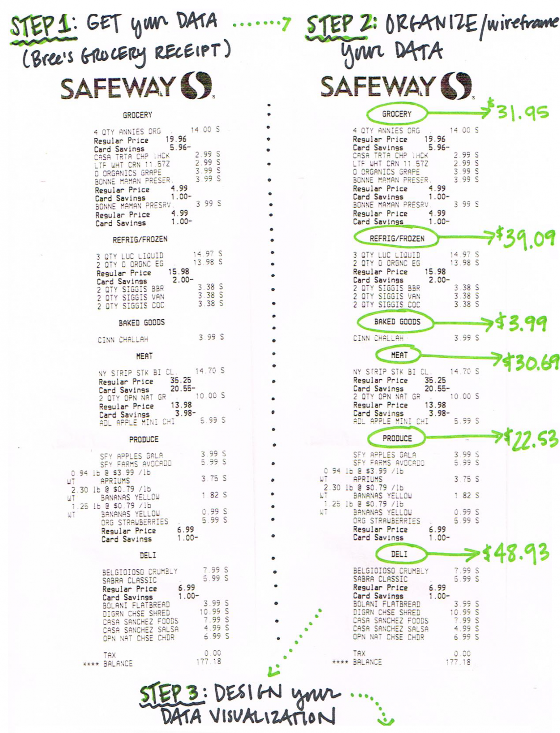
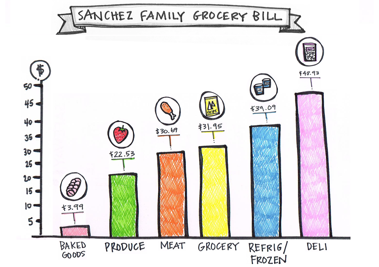
In the second half of our show, we grab some data (my grocery receipt) and a fistful of markers, and follow the three steps to create a simple infographic. Here’s what it looked like (below). Spoiler alert: I spend a lot on cheese!


NibSqueak is our podcast about using visuals to communicate, collaborate, and work better. For a complete episode list, visit nibsqueak.com.
Back


