We’ve been running a series on how to make sure your ideas get heard. This is the third and final installment; you can read the first part here and the second part here.
Let’s consider a second framework, the one we use to improve the ways ideas actually get shared, one in which compelling stories combine with impactful visuals and engaging experiences to get the idea across.
COMPELLING STORIES
This framework starts with compelling stories. Stories are older than language itself, and we as human beings are deeply attached to them. Most of our ways of understanding the world are narratives of one form or another, because stories have the power to both evoke an immediate connection and live with us over time.
Uri Hasson and a team of Princeton scientists recently mapped the impact that stories have on the brain. I mean this literally. They had a professional storyteller tell a story while in an MRI scanner. The MRI recorded her brain activity as she spoke. Volunteers listened to her story and another story while an MRI recorded their results. What did they find? That when people listened to her story, their brains lit up in the exact same way. When she had activity in the emotional part of her brain, the listeners did too. When she had activity on the logical side, do did her audience. By simply telling a story, the woman could plant ideas, thoughts, and emotions into the listeners’ brains. She created an instant connection.
Stories improve the memory of an idea. Joshua Foer, journalist and memory champion, shared in a recent TED talk a way of approaching memory that goes back to the ancient Greeks, the concept of a memory palace where an individual creates a mental narrative and places the things you want to remember. Memory is not just the fact but the context around those facts as well. Stories create an emotional connection; they make ideas easier to remember.
So when the leader of a corporate web group came to us last year to help him build a presentation in order to persuade his colleagues to embrace the power of social media, we opened with a story. Let’s call this guy Jim. Jim wants to find a car that is right for him, but he doesn’t know what to do. He is overwhelmed by the options and has a hard time sorting what features are best for him. Searching the web is not sufficient. Personalizing helped people create a more human connection to the problem the organization was facing, and offered a new way to talk about facts and figures. The business problem was now a human problem, and the conversation became more about customer experience. By the time our leader supported this story with the business case, the idea had already landed. If fact, I was in a strategy session with the client recently and they were still asking what they could do to help Jim find their products better.
This example follows one of the most classic stories structures. A hero on a quest faces and then overcomes meaningful obstacles, and in turn is transformed. And if in some small way the hero is anything like us, we can accompany him or her on the journey and, in turn, be transformed as well. That’s what great stories can do: they change the people who hear, see, or read them.
IMPACTFUL VISUALS
The second part of our framework is impactful visuals. The visual cortex is the largest system in the human brain. Roughly 65% of us are visual-first learners. Seeing is the primary way we understand the world. Images have a way of sticking with us. They are more concrete and complete than words. All at once, they convey both meaning and feeling. Some visuals draw us in, inviting us to look closer. When was the last time a set of bullet points excited you? But a powerful image forces us to stare. Visuals also help us create meaning faster, enhancing our comprehension. We can take in more information at a time through images than through words. It takes mental processing to assemble the meaning of words especially when talking about complex concepts.
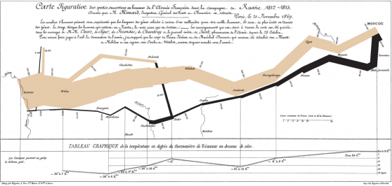
Let’s look at how an ingenious infographic can tell a complex story.
Edward Tufte, the modern king of infographics, calls this map by Charles Joseph Minard “probably the best statistical graphic ever drawn.” For those of you who don’t read French, it chronicles Napoleon’s march on Moscow in 1812. At the top left, you can see Napoleon’s army in full strength at the Polish-Russian border as it begins its disastrous journey to Moscow. The dark lower band shows the decimated army’s retreat back home. The width of the lines shows how many soldiers are still alive, a number that dramatically deteriorates from the huge number of soldiers you see at the beginning (top left) to the tiny number you see at the end (bottom left). And that’s just the beginning of what’s happening in this infographic. Spend more time with it and you’ll learn more about the weather during the bitterly cold winter of 1812, how long it took to travel from place to place, and much more.
There’s a reason we’re still awed by this infographic nearly 150 years after Minard drew it. It’s beautiful and direct, and, more important, it tells a story. Beautiful and direct only gets you so far – your visual has to support and reinforce the story you’re trying to tell.
Now what would happen if instead of the previous infographic, you were confronted with a slide that looked something like this:
- On June 24, 1812, Napoleon’s army set out for Moscow.
- The army started by crossing the Neman River.
- Napoleon wanted to prevent Russian Emperor Alexander I from invading Poland.
- The way to keep Russia from invading Poland, Napoleon thought, was by forcing Russia to remain in the Continental Blockade of the United Kingdom.
- Napoleon’s army was called the Grande Armee.
- Napoleon’s army started with nearly 500,000 soldiers.
- Napoleon’s army made it through western Russia with little problem, but on August 16-18, they fought a battle at Smolensk.
- At first the Smolensk battle seemed like a victory, but the right wing of the Russian Army, under the command of General Peter Wittgenstein, stopped the French in Polotsk. This prevented the French from marching on to St. Petersburg.
- The weather was really bad, often below freezing, and the army was poorly equipped for that.
- And on and on and on …
Would you rather understand something based on that, or on a dense, beautiful infographic? Visuals let you draw your audience in deeper, help them understand more faster, and reinforce your words much more effectively.
ENGAGING EXPERIENCES
The third part of our framework is creating engaging experiences.
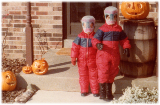
What do you remember most from being a child? Think back and try to identify a specific memory. For me, I remember being dressed in a snowsuit. It was October. I was sitting at the kitchen table, sweating. I had just finished eating. My brother sat across from me with a similar snowsuit and a TV dinner. You know, those awful frozen dinners in the metal trays where you would have mixed vegetables in one compartment, some mystery meat in another, and a dessert in the third? He was unhappy, my mom wanted him to eat his dinner, and he didn’t want to touch the stuff. But she had the upper hand, because the day was sat there was Halloween… and the snowsuits were our costumes. We were space robots and our masks where made from a milk jugs.
We were dressed like this:
So we sat … hot … eager to run outside to be with our friends and collect candy, and my brother was having a standoff over a dinner he didn’t like.
Needless to say, my mom ultimately won and we had a great Halloween.
Now I don’t really remember my Halloweens before, and I don’t really remember the ones after either. Why is that? Studies show that people accurately remember facts and information in the short term but they successfully remember feelings and experiences for the long term.
I know that some of the details I remember from my childhood experience are wrong. I remember that the defrosted dinner was Salisbury Steak; my brother swears it was Turkey Dinner. My memory has us sitting at a kitchen table that I know my parents bought a few years later. But my brother, my mom, and I all remember that day and the standoff. Our shared experience continues to live with us.
The experience that you create for the audience is what will set you apart and make you and your story memorable.
I’m wary of prescribing rules people need to follow if they want to be creative or innovative. Indeed, one of the cool things about breakthrough ideas is that they seem to come from unexpected places: a chance conversation in the hallway, a misreading of a poster in the subway, and that old standby the shower. Let’s celebrate inspiration and the weird ways it arrives.
But even if I don’t want to load you down with rules you have to follow, I do believe that there are frameworks you can follow to make it more likely that your ideas will be as sharp and communicable as possible.
After that inspiration, be ruthless about whether your ideas have sufficient facts to be credible, sufficient feeling to move people, and sufficient function that they connect to the real world.
And when you’re figuring out how best to share those ideas, I urge you to wrap them in compelling stories, illuminate them with impactful visuals, and convey them via engaging experiences. From the ancient Greek playwrights to today’s Hollywood script pitches, that’s what makes people buy your ideas and want to act on them.
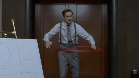
And then you can share your Hula-Hoops!
Back


